Sabtu, 26 Desember 2020

Design Love: Kubus

One of my favourite Scandinavian designers is Danish architect Mogens Lassen (1901-1987).  I am now the proud owner of one of his designs - Kubus 4.  Thank you family; I've had a love affair with this candleholder for years. 

Kubus 4 Lassen accessories
Kubus 4 candleholder in my living room
 I've begun to think up all the things I can do with this beauty, as well as  sizing up the various spots that are crying out for its presence. Its colour and bold form is not easily ignored.  I love the large space in the cube beneath the candles because it allows you to add additional objects to create lovely vignettes. Right now I have my bird bowl by local potter, Erin McArthur.

Kubus 4 adventh wreath
 Idea for next year- advent wreath
 
by Lassen is a family business whose simple mission is to carry the Lassen legacy forward - because good design lives on through new generations. Here are some of the products available today.

Kubus 8, Kubus 4 and Kubus bowl


Kubus 1 has its own design potential

Kubus bowl in beige 


Kubus white with flowers Klassen
Kubus in white with mounded roses
  source
The Kubus Bowl was inspired by the Kubus 4 candleholder. This design is available in several colours, and the design potential is limitless.  You can add a range of things to it:  snacks, plants, flowers, ornaments etc.and/or add new elements under it to create a vignette. Of course it is a beautiful sculpture all on its own. 
kubus 4 copper vignette Lassen
Kubus 4 vignette
source
If you want to have a little Kubus treasure hunt check out  my  recent post on  Scandinavian Design  Elements.  There's one hiding.


Sabtu, 19 Desember 2020

Feeling red

I'm a firm believer that colour provides us with certain benefits at certain times and  I take note when I find myself attracted to a certain colour.  My past loves have been black, green and purple.   All of a sudden I am hugely attracted tored  and I want it around me in my home.  This is a first for me.


red accessories
Red accessories

I catch myself looking at red things on Pinterest and Olioboard. 


I want to hang up one of my red paintings.
 
meaning red poppy art Margaret Ryall
Evoked, 2013, Margaret Ryall, encaustic
 �Painters use red like spice.� � Derek Jarman.....  If so this is one hot painting.

 Why red now?

 From yoga I know that red  is the color for the base or root chakra located at the base of the spine; this chakra allows us to be grounded and connected to universal energies.

Red also affects us physically.  It is stimulating and boosts our physical energy levels, increases enthusiasm, action and confidence, and provides a sense of protection from anxiety and fear. Don't forget that red relates to physical desire in all its forms- sexual, appetite and cravings. Pretty powerful stuff. Who wouldn't want a dose of red around with all those benefits?

I've written about red before so this must not be a new thing.

I must need a boost of red.  I'm listening.  How will it play out in my space? 

 Is red a part of your home decor?

Minggu, 13 Desember 2020

Antlers: Trend or timeless?

Looking at a variety of  recent design sources supports the view that antlers are a huge style statement.    While always part of rustic country design, antlers and antler motifs seem to have crossed all design boundaries to the point where you see them everywhere. 

antlers modern lighting fixture
Spectacular lighting from Yellow Goat Custom Lighting
Right now I have reached the saturation point, and whenever I see antlers my reaction is usually utter boredom. Hopefully I will recover  because I love their sculptural  form and representation of  the passage of time and natural cycles.  I draw the line at their trophy history- no mounted heads for me.

antlers in the sun
 Moose antlers aging in the sun

 source
Several years ago my friend found a lovely pair of moose antlers in the woods near my summer house and dragged them home for me. They are still weathering to a lovely grayish white. While I was excited initially with this gift, I am reticent to jump on the antler bandwagon.  If I wait long enough the trend will pass, like all trends, and antlers will be new again. 

I guess you could say I am very fussy about how they are used in decor.  I think the trick is to mix them with other objects  in simple vignettes  with a natural focus where their sculptural qualities can shine and direct the collected composition. In this  understated way they will always be timeless. So here are my four ways to use antlers for a fresh look.

 As a sculptural element


white antlers  white table vignette
White on white accentuates antlers sculptural quality
source


These antlers are the perfect shape to use with the other elements in this vignette. They mimic  the branches and provide an interesting backdrop for the cylindrical shapes. 

antlers fireplace vignette
Simple arrangements  allow the form to show
What could be more interesting than branching shapes against a dark base?  Less is always more. 


As a design anchor

antlers candles vignette
Antlers and candles in a vignette


There's no doubt that the branching quality of antlers makes them a perfect form to arrange objects along an interesting line.There are all sort of images online with candles interspersed among antlers. You could also use small groupings of wildflowers instead of candles.

As a pivot point

Adding interesting lines in a vignette

Who knew that antlers can actually add a note of elegance when combined with equally elegant objects?  They are great for moving your eye around in different directions encouraging you to take in all elements of a vignette.

As functional objects 

antlers white candleholders
Antler candleholders

These are truly exquisite and would look good anywhere.

Add to planters

Antlers would make a great natural additions to a planter when you have vines or other plants that will grow along a shape.

What's  your take on antlers?  Do you have any in your decor?


Senin, 07 Desember 2020

Leaning art: 4 Guidelines to make it work

Art warms a home, makes it interesting, provides topics for conversation and contemplation , adds colour,  the list goes on indefinitely.  There are various ways to display art; some are more successful than others.  One option is leaning  art against a wall rather than hanging it, but this display option isn't always successful for a variety of reasons.  If you want to try leaning art, consider the following factors.

1. Scale - Choose artwork large enough to read from standing or sitting  position


leaning art

 
 The size of a piece of art in comparison to the space and objects around it usually determines successful placement. This painting fits the bill perfectly.   

leaning black and white large scale art
 Large scale images work best

source
When you want to lean work on the floor it needs to be large enough to observe from standing position and bold in imagery so it can be read at a distance. Even the dog get this!
 The photo on the right works better than the  the art to the left of it because the image is tiny. 


large leaning abstract art dining room

Perfect scale and beautiful work that can still be seen and read while sitting or from other areas of the room. 

simple black and white composition leaning art
Bold form and simple composition

source
The boldness and simplicity of this painting  make viewing it easier when leaned on the floor.  The objects in front of it enhance the placement and help to anchor it safely. They do not interfere with the reading of the image. Which leads to the next guideline...

2. Layering: Don't cover major parts of an artwork

abstract leaning art with chair
Successful layering

source
Layering other objects in front of an artwork is a tricky business.  This vignette is successful because the image is large, dark and has quite a bit of space where there are no details.  The chair and table lie in areas without too much detail.  You don't feel as if you are missing  important elements of the work. 

large leaning artwork behind table
Do you want to remove anything here?

source
There are so many things about this vignette I love, but I want to see all of the artwork and part is hidden by the table and books.  Even removing the books would help things considerably.   Love the candlesticks and the table, both really work with the artwork.


leaning art on mantle
Successful layering where each image is clearly seen.

source
 Layering art on shelves, consoles, and mantles can be very interesting. It is a way to display smaller pieces  to good advantage.  While this is a very simple vignette with the branch acting as a consolidating element, it is possible to have more complex collections of objects.

3. Colour scheme:  Restrict colour combinations in  leaning gallery display

 
gallery wall limited colour scheme
Limited colour scheme provides cohesion

 There are lots of small pieces in this display but they read as one unit because of the colour cohesiveness.

4. Image: Choose the right image for the space

red airplane leaning art
Art with simple bold form


I think the work that layers best in a vignette has bold form and colour.  It can compete with the other objects for your viewing attention.


Now it's your turn.  What do you think of this arrangement?

 framed art leaning


8 Simple ways to make your space interesting

Details in decor can make or break a design especially when you have a more minimal look (not a lot of stuff around).  You need something interesting  to draw the eye and provide a  momentary resting place.  It might be a texture, a beautifully shaped stool, or an embellishment.  A space without details is immensely boring and who wants a boring home?   Here are simple ways to add some pizazz to your space. Each  space will have a different starting point.


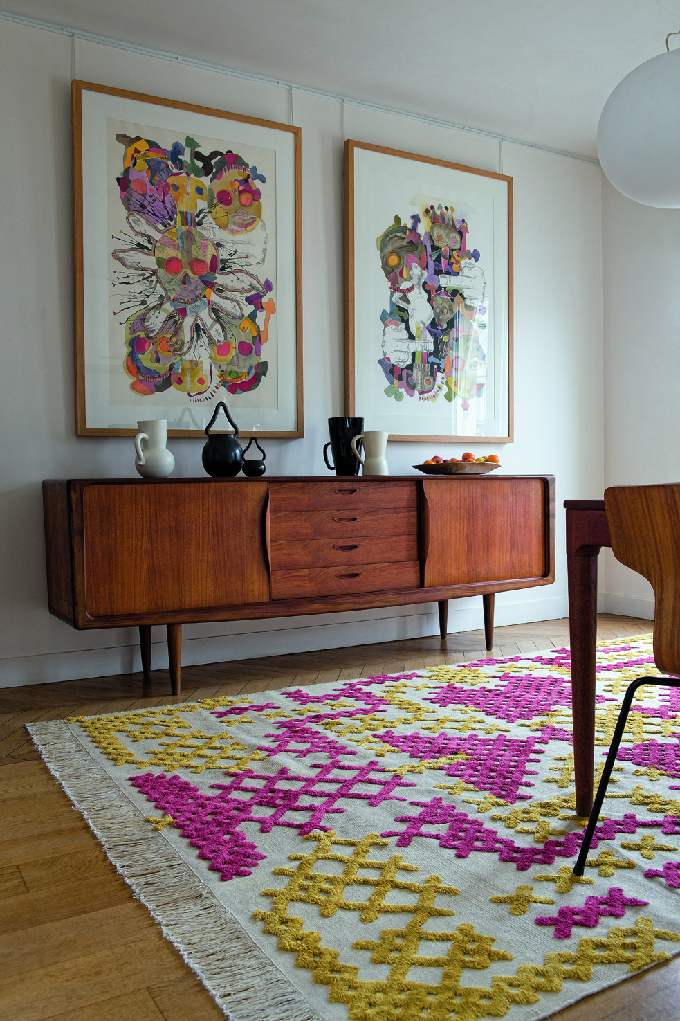
1. Use art  to create a vignette


art vignette yellow interesting space
Eye catching art anchors design

Choose eye catching art and use it to create a vignette.  In this space the yellow chair creates a visual flow from the artwork and it is anchored by the stripes in the rug. Books provide a casual look but other items could be added to the bench to continue the tone set by the art.

   2. Add pattern and texture

greek key pattern texture interesting space
Greek key detailing adds interest

The addition of pattern to any space instantly makes it more interesting .  Also consider using texture for a quiet way to add additional interest.

 3. Bring the outside in

wood stool bathroom interesting space
 Add outside materials inside


 Who wouldn't notice the natural wood element in this stool in a hard edged bathroom.  The repetition of natural shapes from outside to inside woks so well to move the eye to the welcoming outside view.

4. Layer furniture and accessories

bookcase wallpaper focal point interesting space
Patttern and colour with accessories create a complex focal point

 Some focal points are large and a room is created around them.  Other times a secondary focal point can be introduced in a quiet corner of a space. This solution works when there are several seating areas in one space. Layering furniture and accessories is one way to create interest.


5. Choose spectacular lighting

Tom Dixon lighting interesting space
 Spectacular Tom Dixon lighting


 Who could ignore the variety of shapes in these black pendants  that anchor the dining space in an open concept home? There are all kinds of lighting choices to adorn your space.  Find the one that is right for you.

6.  Use geometry

black white stripes hexagons gold  interesting space
 Black and white is always eye catching

When you combine several geometric shapes in one vignette, it can create a powerful focus.  When you add high contrast it is difficult to ignore.  Pop some gold into the combination and you have to look - more than once!


 7. Use common items in unique ways

starfish mirror interesting space
 A simple starfish repeated many times

Take one starfish and it has an interesting shape.  Repeat that shape many times by overlapping and you have a sculpture that begs to be looked at and touched.


8. Use pops of  warm colours

Red is an eye catcher

If you want instant attention choose red, yellow or orange as an accent.  Warm colours beg to be noticed by advancing visually in your space.

Now that was easy.  If you have a space you aren't pleased with perhaps one of these suggestions might help to create more visual interest. Do you have favourite ways to create interest in your home?

Kamis, 03 Desember 2020

Thursday Tip # 11 - Art and space

After a long hiatus I am back to Thursday Tips at the request of a reader who liked these short and to the point tips for "small improvements that have big impact".  For this week my favourite topic - art.


The biggest mistake made when hanging art is not matching the size/shape of the art work to the space you are hanging it.   Work should look "comfortable" in its space not cramped or looking like it is awash in a sea of wall.

art vertical space
Layout follows vertical space

 hanging art console
Long console needs substantial work to fill space


hanging art stairwell
Perfect  size and composition for top of stairs

hanging art bedroom
Size and shape  works with width of headboard


hanging art sofa
Art shape and size  follows wall shape

And there you have it.  Large works for large spaces or smaller works massed together for impact.  No little pieces lonely on a big wall.  No large pieces squat into a small space.  Oh, did I mention I have a lot of opinions on gallery walls?  I'll save that for another tip.

Minggu, 29 November 2020

Thursday Tip # 12- Art above the sofa

Do you have  one big blank space above the sofa?  Are you wondering how to fill it?  If the number of questions I get about this is any indication there are lots of question marks out there about this topic.  Ta da... answers.  I  introduced this topic a little in last week's Thursday Tip  when I discussed scale, but I wanted to give more formatting options this week. 

 This is an area where there are lots of thoughts on how to and how not to hang art for best effect.
My guideline is to think about ways to fill at least 2/3 the width of the furniture. It is often difficult to find large scale art so think about pairings of various types.  It also looks good if your art expands to the edges of the sofa.  Once you go beyond  sofa width the art starts to look very top heavy and the sofa  is diminished. You should also consider the height of the art.   Remember it is a long way to the ceiling so refrain from work that is only twelve or 14 inches high.  It will look lost even if it is long enough.

I have to thank  Interiors PL    for creating this great graphic that provides many options for what to hang over a sofa.

ideas for hanging art over sofa
11 options for hanging art over a sofa.

My favourites in these options are  4, and 6-11.  They all fit the guidelines I discussed above.  1 and 3 are my least favourite because they don't fill up enough space for me.  I like 5 because it is asymmetrical  and I could balance this placement by adding things on the left of the sofa to create a pleasing balance. Richard Mishaan discussed  another aspect of asymmetrical placement in a House Beautiful post.


design tip hanging art assymetrical
Why asymmetrical layouts work

Here is the same idea expressed in one of my painting compositions called Breathe.

ayssemetrical composition acrylic painting Margaret Ryall
 Margaret Ryall, 2004, Breathe, acrylic on canvas, 12 x 24in.

 Are any of these options wrong?  Not really.  There are only guidelines in interior design,  no right or wrong. 

Do you have a favourite way to arrange art above your sofa?  Please share.

Rabu, 25 November 2020

The big cover up

No it's  not a scandal!  Nothing juicy really.  I got to thinking about the artful display of throws when I came downstairs this morning to find this jumble left from the night before. 


I am interested in comfort and function as well as style.  While this throw gets used almost daily it  also adds to the overall feel of our family room.  In terms of design, the main attraction when I  first saw it at Costco  was its texture and muted colour;  I knew  it would sit nicely on my family room sofa and not disrupt the pattern play of the two pillows.

accessories throws   Designing Home
 Margaret Ryall

Here is where it first lived when I brought it home.  After several new furniture purchases the chair has moved to another room and the throw and pillow are now on the sofa. As you can see, it still serves the same design purpose  as on the chair by adding texture. Apart from function, here are some of the reasons a throw might be a good purchase for your living room:


Use a throw to add texture to a space.


This throw has two elements for the price of one.... lots of pattern too.


The ultimate texture ... fur real or fake.


In this perfectly neutral scheme the throw adds very subtle texture.


Use a throw to solve a design dilemma

 Margaret Ryall

This Turkish throw helps integrate the railing between my living and dining room  into the colour flow without having the orange undertone in the stain as an accent colour.  It also serves to break up the expanse of rail. .


If these lovely navy and white throws were not on these chairs they would totally disappear into the wall. They also serve to add a third pattern into the scheme.

Use a throw to add an accent colour


This is an interesting arrangement of throws in a chair.  I would rather not see the fringes, but the layering is subtle and lovely. Love the yellow and gray.


It seems  yellow is a very popular colour accent! The National Geographic magazines under each table are an interesting touch given the area rug looks like written text.


This room has a lovely colour flow and the folded throw moves the green to the two ottomans. 


 Use a throw to add pattern


 I have throw envy with this one.  Love the bold geometric pattern, and I quite like a throw over the arm of a chair. Notice the other one on the lounge section.  Lots of texture.  Two seems excessive to me, but probably there are two homeowners who like to cover up.

 Stephanie Wiley Photography

Although the pattern is very subtle on these chairs, it does add to the room.  I think I would have added it in the pillows, but that's just me.